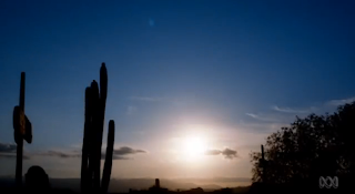
My interpretation of Rule Of Thirds is when an image is initially divided up into a grid of nine squares (two equally spaced horizontal and vertical lines) and along these lines lie the main focal point of the scene, in the above images case: the cactus vegetation and the horizon all lie on this grid.
I think this style was used in this scene to make this image more aesthetically appealing, clean cut and overall more even and balanced. This styles overall makes the image more presentable and allows for the audiences attention to be drawn to any objects of interest which would respectively set the scene i.e. the cactus implys a western styled setting. This results in a more engaging better looking image that grabs the viewers attention by highlighting various objects and details throughout the image.
No comments:
Post a Comment